ACT Science graphs are easier to use when you read their labels before interpreting their shapes. Identify the variables, units, groups, and scale; then locate the exact information the question requests. A rising line might describe height, temperature, or concentration. Its meaning comes from the labels and the experiment, not from the fact that it rises.
ACT describes Science as a combination of interpretation, investigation, and evaluation of evidence. You may need introductory science knowledge, but you should not replace the information in a passage with a remembered fact that the question does not support. Calculators are not permitted in Science.
Start with four labels
Before answering a data question, locate:
- The horizontal variable and its unit.
- The vertical variable and its unit.
- The legend identifying groups or conditions.
- Any caption or note that limits how the data should be interpreted.
Do not assume that every axis begins at zero or uses equal visual spacing for equal numeric changes. Inspect the printed values. A change from 1 to 10 to 100 behaves differently from a change from 1 to 2 to 3.
For a table, the same habit applies to its row labels, column headings, and footnotes. A value can be read accurately and still belong to the wrong group.
An original practice investigation
Imagine two groups of seedlings of the same species. The investigators use the same soil, water schedule, and pot size. Group A receives four hours of light daily, and Group B receives eight. They record mean height over six days.
These invented numbers are for practicing interpretation. They are not results from a real experiment or a claim about how all plants respond to light.
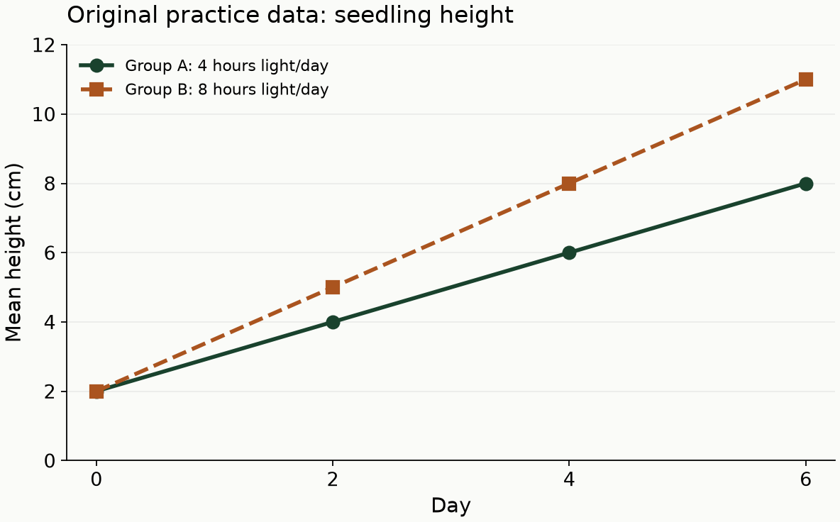
| Day | Group A mean height, cm | Group B mean height, cm |
|---|---|---|
| 0 | 2 | 2 |
| 2 | 4 | 5 |
| 4 | 6 | 8 |
| 6 | 8 | 11 |
The horizontal axis is time in days, not daily light exposure. The legend explains the light conditions. Confusing those roles would change the meaning of every comparison.
Retrieve one value before combining values
If the question asks for Group B's mean height on day 4, find day 4 and follow the Group B series: 8 centimeters.
A second question might ask when Group A reaches that same mean height. Now you need a comparison: Group A reaches 8 centimeters on day 6.
The correct number from one part of the display is often a distractor for another part. After locating a value, silently attach its label: “Group B, day 4, eight centimeters.” That short description makes accidental swaps easier to notice.
Distinguish a final value from an increase
Group B ends at 11 centimeters, but its increase from day 0 to day 6 is:
11 − 2 = 9 centimeters
Group A's increase is 8 − 2 = 6 centimeters. Group B therefore gains 3 centimeters more over the interval.
The word increase asks for a difference between two measurements. The word height may ask for a single measurement. Read the requested quantity before choosing an answer.
If a problem asks for a ratio of the increases, the ratio is 9:6, or 3:2. Using the final heights would give 11:8, a different comparison.
Calculate an average rate over a stated interval
Between days 2 and 6, Group B rises from 5 to 11 centimeters. The average rate is:
(11 − 5) ÷ (6 − 2) = 6 ÷ 4 = 1.5 centimeters per day
Group A rises from 4 to 8 centimeters over the same interval, giving 1 centimeter per day.
The denominator is elapsed time, not the ending day number. Dividing by 6 would incorrectly use the entire time since day 0 while retaining an increase measured only from day 2.
Keep the unit in your answer. A rate expressed as centimeters per day is not the same quantity as a height in centimeters.
Separate interpolation from extrapolation
Interpolation estimates a value between observations. In this example, estimating Group A's height on day 3 from the surrounding day 2 and day 4 values would give about 5 centimeters if growth between those points were treated as linear.
Extrapolation extends beyond the measured interval. Continuing Group B's pattern to day 8 would suggest 14 centimeters, but that is a model-based prediction, not an observed value.
A plant might later encounter a limiting condition, and the trend might change. On a test question, follow the assumptions it states. In your explanation, preserve the difference between a measurement and an estimate.
Compare groups without overstating the conclusion
The displayed results show that Group B has a higher mean height after day 0 under the stated conditions. They do not show that every individual seedling in B is taller than every seedling in A. A mean is a summary, not a list of all observations.
The table also does not tell you the number of seedlings, the variation within each group, or whether the result would recur across trials. Those details matter for evaluating the strength and scope of a scientific conclusion.
If a question asks which conclusion is supported, prefer a claim that matches the measured groups and interval. “Eight hours of light always produces taller plants” goes beyond this small, hypothetical investigation.
Use the experiment description with the figure
A graph may not contain all the information needed to answer a question. The passage might explain that one trial used a different temperature or that all measurements were taken after a waiting period.
Identify the independent variable: the condition deliberately changed: and the dependent variable: the outcome measured. In the example, daily light exposure is the changed condition and mean height is the measured outcome. Time organizes repeated observations.
If two experiments change different conditions, do not treat matching column labels as proof that every other variable stayed the same. Compare the setup descriptions before combining their results.
Review errors by the step that failed
A useful Science review log separates these mistakes:
| Error | What to check next time |
|---|---|
| Read the wrong series | Name the group before tracing the line |
| Used final value instead of change | Identify both endpoints |
| Divided by the wrong interval | Subtract starting time from ending time |
| Misread the scale | Inspect numeric tick labels |
| Claimed a prediction was observed | Mark estimates separately from measurements |
| Overgeneralized the conclusion | Limit the claim to the studied conditions |
Start untimed with a few displays, then add timing once you can explain the comparisons reliably. Rushing through more graphs without correcting a recurring unit mistake can simply rehearse that mistake.
The ACT score calculator can help interpret a matching official practice form, including optional Science and STEM. It cannot diagnose whether a missed question came from reading a label or evaluating a conclusion. Your worked explanations supply that information.
Keep Reading
- ACT Science Strategy: Read the Evidence Before Relying on Memorization
- ACT Math Word Problems: Turn the Situation Into an Equation
- ACT Science Conflicting Viewpoints: Track Claims and Evidence
Explore SHSPrep's ACT prep program for lessons, targeted practice, and two original full-length mock tests with raw performance results.